@thunderphone/widget npm package and is also available via CDN for non-bundler environments.
Prerequisites
Before embedding the widget, complete these three steps in the ThunderPhone Dashboard:1
Create a publishable API key
Go to Developers in the dashboard settings and create a publishable key. Publishable keys start with
pk_live_ and are safe to include in client-side code.2
Configure allowed domains
In the same Developers settings, add the domains where the widget will be embedded.
localhost is always allowed for development. Wildcards are supported (e.g., *.example.com).3
Create a web widget
Go to Web Widgets in the dashboard and create a widget. Select the agent you want to expose and the publishable key to use. The agent is resolved automatically from your publishable key configuration.
Quick Start
Install the package:Customization
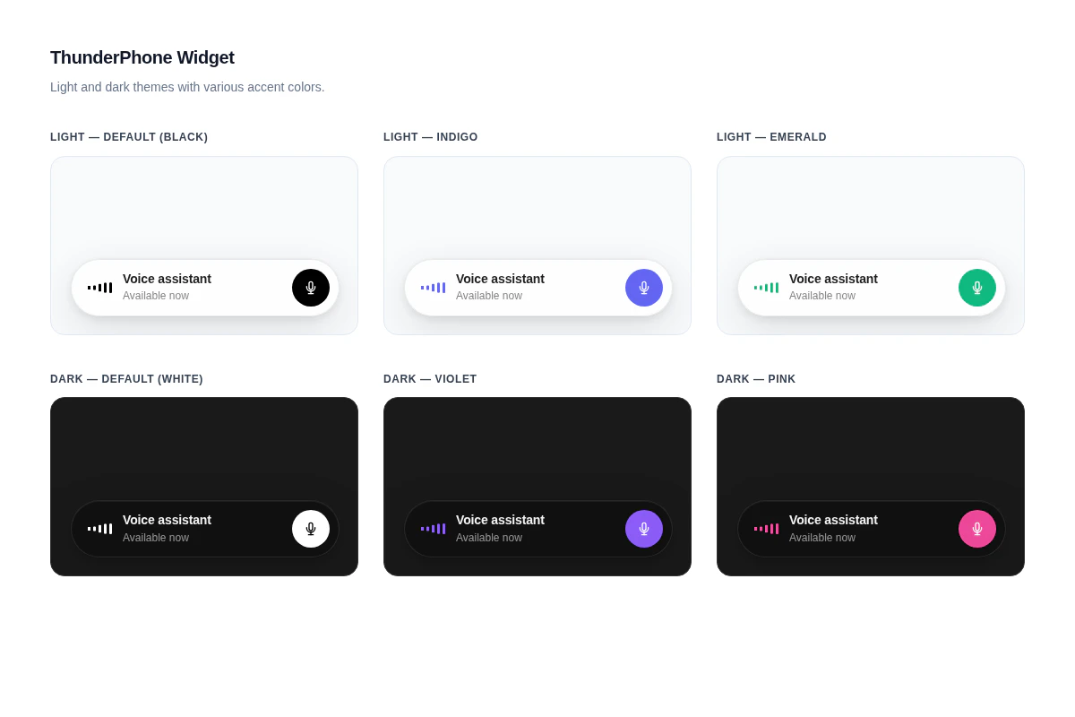
The widget has four appearance props:
See the React component reference for the full props table.
For a fully custom UI, use the headless hook to manage the voice session while you build your own interface. The hook exposes real-time audio levels for building audio-reactive visualizations.
Integration Options
Choose the integration method that fits your stack:React Component
Pre-built UI component with built-in call controls and status display. Import, pass props, done.
Headless Hook
Full control over the UI. The
useThunderPhone hook manages the voice session while you build your own interface.CDN / Script Tag
No bundler required. Load the widget via a script tag for static sites, WordPress, and other non-React environments.
Styling
The widget ships with built-in light and dark themes controlled by thetheme prop, and an accent color controlled by the primaryColor prop. For deeper customization, you can override CSS custom properties and classes. See the Styling guide for details.
Need help? Contact us at support@thunderphone.com